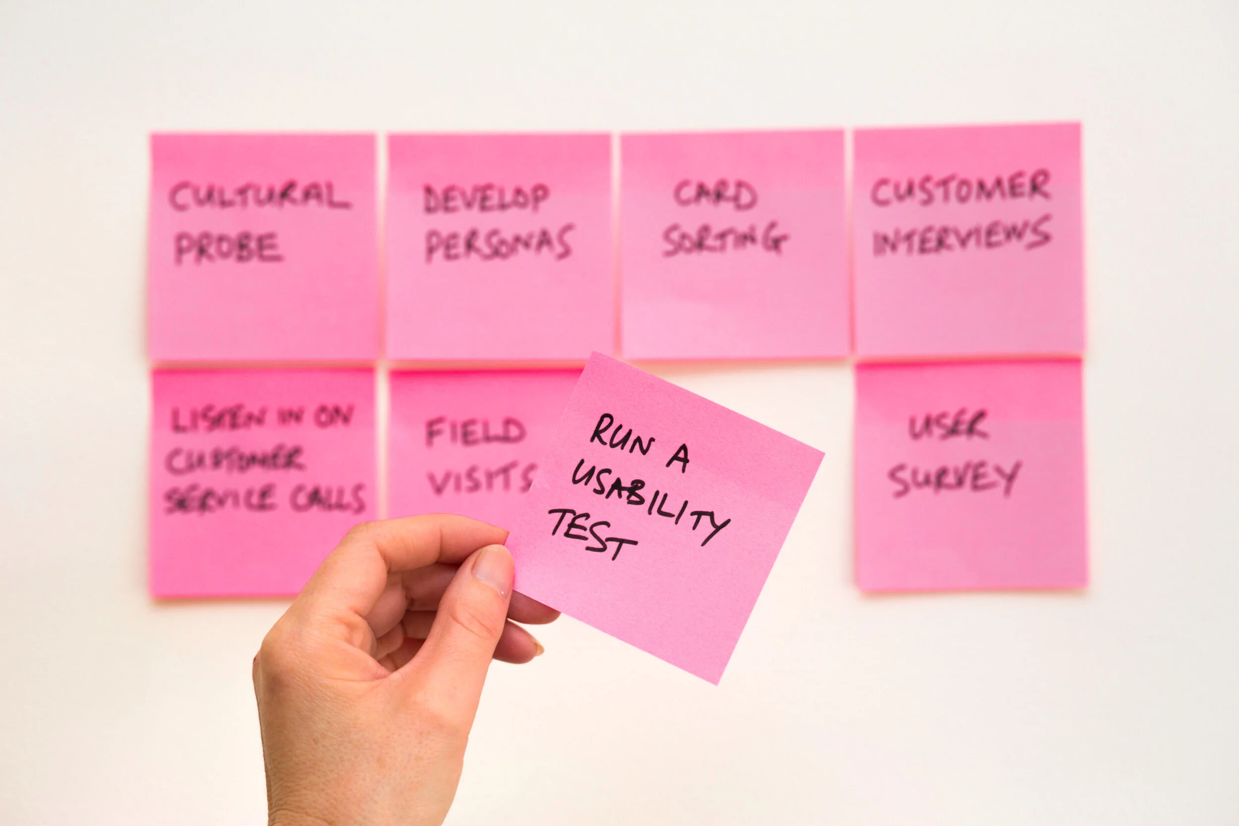
The what, why, and how of my process
TL;DR
Plan it out.
Start with the problem and leverage empathy-based research. After exploring the problem without any constraints, bring everyone together. Collect constraints, requirements, and questions from the team.
Design and iterate.
Test early, test often. Whenever possible, leverage low-fidelity prototypes to save time and money. Keep your process transparent so no one ever feels caught off guard. Encourage key stakeholders to take part in collaborative design exercises.
Launch and land.
Share the design journey and get feedback from the team. Respect your engineers and their constraints. Respect the business and its goals. Listen to your teammates. How can we improve our trajectory? Figure out the next steps and keep going.
Isn’t design all about aesthetics?
Never go in blind.
I do not believe in designing blindly. Yes, there are popular design languages. Yes, there are certain design principles we should all follow. But all of these things are utterly useless if they are not backed up by sound research. And that all starts with empathy.
Sadly, “empathy” has been getting thrown around the technology community as much as “innovative” and “disruptive.” To the point where it has lost some of its meaning. Genuine empathy is more than understanding the feelings of another person. It involves experiencing them yourself. Achieving that with an end-user requires time, patience, and an open mind.
Research without genuine empathy risks bias and prejudice creeping into the design process. That’s not a criticism — it’s just human nature. Research with empathy will allow you to reveal what users need from your products by exploring and appreciating their behaviors and motivations.
The end result? Experiences that feel more intuitive, accessible, and even magical.
Applying the why to the what
Confused? That’s ok, you’ll see what I mean in a second.
Two things guide my design process: a tremendous love of people and a fascination with technology.
The former comes to life through the empathy-driven research described above. The latter comes alive when that research is correctly applied to beautiful devices, platforms, and experiences.
How do I go about doing that?
Craftsmen have their own toolboxes. Each tool has a purpose and is incredibly useful in getting the job done and getting it done well. But you wouldn’t use a screwdriver to hammer a nail.
Similarly, user experience designers have their own toolboxes. But these toolboxes house a variety of research methods and design tools. With each new project, you won’t necessarily use the same tools. Part of being a great designer is not only knowing how to use tools, but when and why to use them.
Face-to-face conversation
Get the lay of the land
A casual interview with Olivia about her experiences with roommates. Part of a need-finding mission for one of my projects, Roomalign. Things get juicy around 1:50 and super-juicy around 3:20.
Need-finding view interviews, surveys, and more.
I love getting out in the field and meeting with people face-to-face.
So, I usually start by conducting interviews and contextual inquiry. I feel many designers fall for the trap that this only involves the end-user, but it’s so much more than that!
Designers should interview the user, of course, but just as importantly, engineers, product managers, and any other key stakeholders. Doing so, along with secondary research, helps establish the necessary requirements and constraints. What do you get? A beautiful merger of user and business needs.
Surveys, evaluative usability tests, and other methods are just as useful when done properly and with good reason. You’d be surprised how often I’ve heard someone say “let’s A/B test it,” with no rationale or framework to back it up.
Bring out the Post-its
Synthesizing the data.
Unlike the Moleskin journals in my drawer, I have thousands of Post-its that have all gone to good use.
Here's where I'll grab a sharpie, a pack of multi-colored Post-its, and pull in the broader design team. I feel that everyone calls this process something else, but I was taught to call it affinity mapping.
First, I'll give everyone access to the data I've collected. And I mean everything. Transparency is key.
I'll split up the data with the team and write one significant insight per Post-it. It's usually a quote, an observation that was made, or a prominent theme. I personally like to color-code each of these (e.g. red Post-its for quotes, blue for observations, and green for themes). Quotes and quantitative measures are objective, while observations and interpreted themes are already entering into a world of subjectivity. Seeing them separated on the wall is really important to me.
Next, politely get everyone (including myself) to shut up. In silence, but as a group, I'll sort these Post-its into categories. To avoid silent, passive-aggressive sorting fights, I like to limit myself to placing or moving an existing Post-it only once during this round.
Get the group back together and talk about what you see. There should be some obvious "what" categories.
Run this process a couple of more times as a group and underlying "why" groupings usually start to show themselves. I like to frame these groupings in the voice of the user. For example, if we were exploring music-streaming services, a "why" cluster could be framed as "sharing new music with my friends shows them I care about them."
"Why" groupings are more tangible than "what" groupings, but I find that it's important to make this data come alive through the medium of an archetype.
Affinity Mapping
Here’s a photo of me during the first sweep of an affinity mapping session. A lot of “what” on the wall.
Framing the user
The Dreamer
According to Creative Types by Adobe, I am The Dreamer. You can read more about this archetype and, by extension, me, by clicking here. It’s kinda cute.
Personas are out.
Archetypes are in.
Personas and archetypes serve the same function. They give everyone in the team a tangible and personified way to connect with the data.
Unlike archetypes, personas run the danger of introducing bias and prejudice.
For example, let's say I have a persona named Jim. Jim is a 65-year-old white male living in West Virginia.
Without reading anything else about Jim, would you believe that Jim is incredibly savvy with his iPhone and FaceTimes regularly with his grandchildren? Probably not, and that's not your fault. We assume so much about people based on their age, place of birth, and race. I believe good design doesn't depend on those characteristics, but the underlying personality type.
Instead, the same research data that created Jim could be used to create the Family First archetype. Family First values providing and caring for their family before everything else. They are willing and excited to learn about new technologies and platforms that allow them to keep in touch with distant relatives.
See? Same core, safer container.
Finally, I like to frame the problems and pain points my archetypes are having in the form of a "How Might We" statement. It doesn't take long to do, and it's a really great way to ground yourself and the team before you start ideating.
Stanford's d.school has a really great way of summing these up and the value they create.
Here's a quick recap.
Ok, empathetic research has helped me create a set of archetypes, each with their own needs and pain points. It's time to sprint.
Ready, set, go!
Other than connecting with people via research, this is my favorite part of the design journey.
There are no stupid ideas here. This is where crazy ideas get to bounce off the wall and burst through the roof. The only thing I ask myself during this process is: "Does this solution actually address the needs, pains, and preferences of our archetypes?"
I intentionally did not include business goals here. Why? Because that'll create a sense of fear and restraint in the room that may block some incredible ideas from coming to the surface. You can always scale down via a MVP or other methods, but only if the idea is given a chance to breathe.
Here we go:
Grab the engineers and anyone else that is willing to be involved
Do a quick recap of the archetypes we've come up with
Silently and independently draft as many ideas as you can in ten minutes
Have everyone in the group share their ideas and the rationale behind them
Repeat steps 3 and 4 as many time as you'd like
Discuss and, as a group, agree on a set of solutions to run with
Within the collection of agreed-upon solutions, I like to include a dark horse idea. An idea that may seem entirely crazy, stupid, or counterintuitive. In my experience, trying to solve a problem unconventionally often highlights critical insights and shortcuts you can use in other solutions.
My preferred processes and tools
Design → Iterate → Design
Design Studio and Whiteboards
Unlike the sprints mentioned in the ideation stage above, this is when I like to reintroduce constraints and business goals.
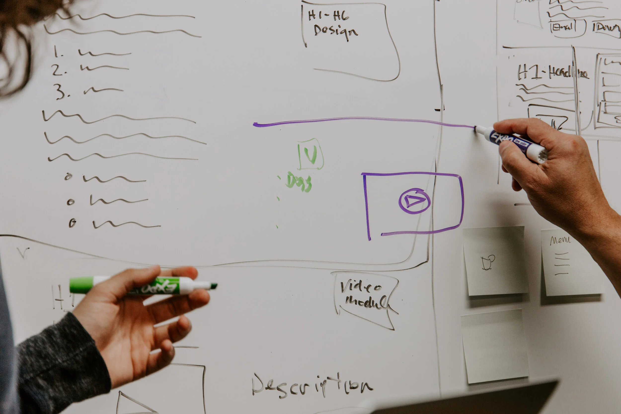
Design studios as a group is a great way to draft out many ideas while considering constraints. Whiteboarding effectively accomplishes the same thing, but allows one person to take the lead while talking through their thought process and being critiqued by the team..
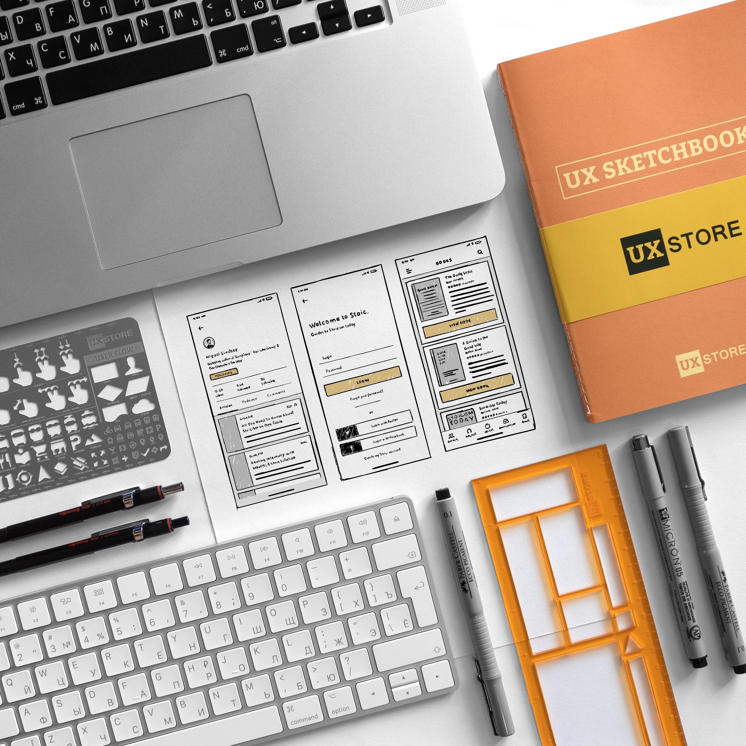
Wireframes
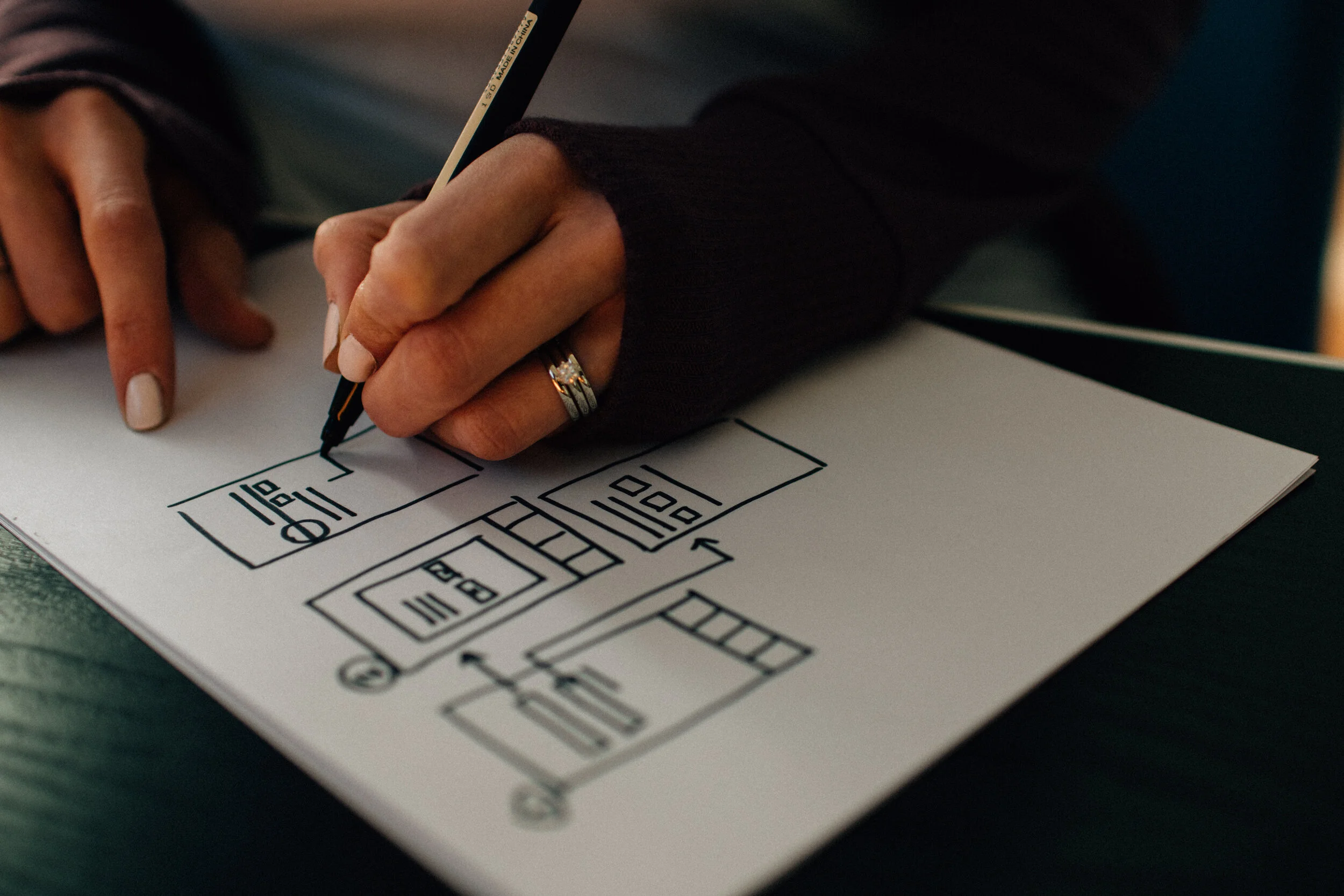
Here’s where I try and delete every color and “beautiful” shape from my mind. My only concern is whether or not the solution allows the user to easily and effectively achieve their goal. Boxes, lines, arrows, dots, and circles. You don’t need much more than that.
Paper Prototypes
I’m a huge advocate of paper prototypes as they save designers time and the business money. The time and cost associated with change are proportionate to the level of fidelity.
Adobe Creative Suite
I'm very comfortable with the entire suite, but I spend most of my time in Illustrator and InDesign. Illustrator allows me to get past some of the constraints within Sketch when creating vector assets, while InDesign enables me to communicate my process and rationale to key stakeholders in a visually appealing way.
Figma, Sketch, etc.
I love Sketch, but I feel far more at home when I’m using Figma. After learning how to take advantage of its system of symbols, I can accomplish so much, so quickly. I use Figma for all of my digital wireframing and designing prototypes.
InVision and ProtoPie
In my experience, InVision is the best tool for creating interactive prototypes quickly and effectively. However, I love using ProtoPie when it comes to designing prototypes that really need to bring animations and subtle interactions to life.
Style-guide included in part of a design library I created for Enklu
A collection of components based on the style-guide
The design library brought to life via a high-fidelity prototype
Evaluative research
Iterate → Design → Iterate
Usability Testing
I believe in doing this early and as often as possible. You can run them with prototypes of all levels of fidelity, and the information gained is priceless. It allows you to see potential end-users interact with the product before launching it. Most importantly, usability testing will enable you to know if you're actually solving the problem at hand and, consequently, course-correct if necessary.
Accessibility Evaluations
The why behind running accessibility evaluations is rooted in empathy. I believe your products should work magically, no matter who is using them.
A/B Testing
I absolutely love A/B testing, but I would never run it on a significant change. To me, A/B testing is most valuable in investigating minute issues. For example, if I measured engagement via successful form completion and I couldn't get that rate past 80%, I would deploy an A/B testing to test how minor changes in copy, interactions, and visual design could improve the success rate.
Design Reviews
Like usability testing, design reviews should be done early, often, and face-to-face. Get all the key stakeholders to the table and anyone else that wants to be part of the process. I find incredible value in these as it allows the team to ask crucial questions and maintain trajectory toward solving user and business goals.
Pair Designing
This is a method I stole from my time as a software engineer. Pair programming involves having one person write code while another person sits next to them watching and commenting. Applying this to the design process is just as valuable because both software engineering and design share the common core of solving complex problems.
More Research
If it's clear that we are not solving our user's problem after testing, review, and discussion, it never hurts back to get back in the field and do more research. Usually, the scope of questioning will have improved, and you'll get to the next layer of the onion.
Review and revise.
Bringing the team together.
At this point, I’ve worked with the team from research to design. It’s important to step away and get feedback early and often. My job as a researcher and designer is to understand my user, feel their pain, and help them alleviate it. But there is a lot more at play.
We need to make sure we’re respecting the constraints that have been placed upon us, and meeting our business goals.
This is a great time to ask the following questions individually and as a group.
“Do the patterns, interactions, and animations allow the user to achieve their goal in an intuitive way?”
“Does our solution demonstrate why it’s better than our competitors?”
“Does our design spark joy?”
Share the journey face-to-face.
Bring everyone to the table. I am a strong advocate of the agile principle of face-to-face communication. Share the journey and get feedback.
Keep an open mind, and let go.
Remember that we're not designing for our own tastes or needs. We have business goals to meet, and user needs to solve. If feedback goes against the work you have created, don't take it personally.
Figure out your next steps.
What's next? Face-to-face reviews allow the whole team to get back in alignment and figure out what to do next.
Here’s what I hope to have accomplished.
I hope I communicated the why behind the how and what.
If you made it through the walkthrough of my design process, email me, and I'll send you a digital medal regardless of your decision. I spent a lot of time putting it together and genuinely appreciate you taking the time to read it.
Still, here are the highlights:
Good research depends on genuine empathy
Bring that research to life through archetypes and stories
Designers have toolboxes, which tools they use depends on the problem at hand
Knowing how to use a tool is irrelevant if you don't understand why and when to use
Get feedback early and often
Design and advocate for the user first, with business goals and constraints coming immediately afterward
Empathy, empathy, empathy
I hope you learned a little bit more about me as a person.
So often these days, we are nothing more than a username, profile picture, or resume stuck in a digital stack. I really hope this page allowed you to get to know me not only as a designer, but as a person.
If not, I hope this page made you at least chuckle or grin.
If I didn't accomplish any of the things mentioned above, please contact me! Any and all feedback is welcome.

