Mobile-First Design at Enklu
Project summary
Getting lean and mean
Creating a mobile app with a robust feature set.
This was a month-long sprint I completed while working as a contractor for Enklu.
I worked as the sole user experience designer, responsible for everything from research to creating a high-fidelity prototype.
What was the problem?
Enklu needed a mobile app that could highlight its offerings, user content, and work as an experience controller when connected with a Microsoft HoloLens.
Enklu’s previous mobile app functioned as a photo feed. There wasn’t much more there. After launching their first venue to show off their software and AR creations, Enklu needed a more robust app. That’s where I came in. The issue? The desired feature set was incredibly robust and, at times, conflicted with itself.
Addressing the limitations.
With limited direction and resources, I had to get scrappy. By adopting a lean UX workflow and learning from what competitors had done right, I got the job done.
Startups move a mile-a-minute. With everyone having their own priorities and projects, I needed to take solace in a lean UX workflow to get the job done. I tested early and often. I built and tested one essential flow at a time. I adapted to changing business requirements and differences in opinion from key stakeholders. I constantly sought ways to work smarter and faster.
Reaching a solution via an agile and iterative approach.
By communicating status through color, establishing a clear content hierarchy, and leveraging proven patterns, I created an intuitive experience for the user.
Looking at the successful patterns present within platforms like Instagram, Google Maps, and Eventbrite inspired me to create a clear hierarchy, and intuitive user flows. Established color patterns and animations allowed me to communicate status in a way that was familiar and memorable. Clean remotes like Apple’s Siri Remote provided me a foundation to build the experience controller. Check, check, and check. I even created an entire design system along the way.
What is Enklu?
Here’s some context
Enklu is an augmented-reality startup based in San Francisco, CA.
They have created an online editor that is essentially the Google Docs of creating augmented-reality experiences.
When I joined as a contractor, they had just launched their first space in San Francisco’s Westfield Mall dubbed, E.den.
Before E.den, the Enklu team was diligently creating experiences for other companies and working on their online editor.
While I was there, I helped draft up a logo for E.den, created graphical assets for numerous events, created a set of archetypes based on research, and overhauled the mobile app. Like any startup, a lot was going on all the time.
Balancing business and user goals
Here was the ask
Create a revamped mobile app with the following features:
The user should be able to browse experiences and make reservations
The user should be able to check-in and control experiences from the app
The user should be able to see snaps other users took within an experience
Get lean and mean
I took solace in a lean UX workflow.
Usually, I would go out into the field and conduct extensive research to get a better picture. Because of time constraints and the nature of startup culture, I had to move fast.
I tested early, often, and worked on designing key flows in parallel rather than holistically. Additionally, I took advantage of the set of archetypes I had created from empathy-based research. Leveraging the data driven archetypes I had created along with frequent usability testing allowed me to create a cohesive and intuitive experience.
Competitive analysis
Looking for inspiration
Keeping things social.
I looked at the usual suspects for inspiration: Instagram, Facebook, YouTube, and Twitter. Data suggests that people don’t mind vertical scrolling on mobile, so queue up the infinite timelines.
Events and foot-traffic.
My biggest inspiration was Eventbrite. I felt that their form design for purchasing a ticket on mobile was incredibly clean. Moreover, they offered so many ways for the user to access their ticket after purchase.
Controlling an experience.
I feel that the digital metaphor of a physical remote has become pretty standard. Still, I focused on remotes that could easily be used with one hand and without looking.
Organizing your thoughts in a fast-paced environment
Making sense of my chicken-scratch notes
One of the great joys and stressors of working for a startup is that everyone and everything is moving past you at the speed of light.
When interviewing or validating designs with users, I rarely had time to do so in a formal setting.
More often than not, I would strike up a conversation with a user as they came into E.den. I was less focused on getting information out of them and more focused on developing and refining a set of archetypes I could use during the design phase.
Watching people isn’t weird if you’re doing user research.
A bulk of these notes were taken while observing or talking to users as they were walking into E.den. I made an effort to not disturb anyone, grabbing them only on their way in or out.
Kids are always honest.
At one point, we hosted a birthday party for colleague’s kid. We had about a dozen kids running around in Microsoft HoloLenses, absorbing and reflecting (sometimes very loudly) about their experiences. I learned a lot from them.
Refining and leveraging archetypes.
From this two-day burst of observing, interviewing, and validating designs with users, I learned a lot about what drives our users to explore, create, and share:
More than anything, our users valued the bond created by a unique, shared experience in AR
Like the kids that visited us, Enklu literally attracted an archetype that valued unaided exploration
Similar to a bookworm, many users valued moving slowly through an AR experience, absorbing every piece of the narrative that they could
Iterations one, two, and three
Designing the app
Working with limited information.
At first, I felt pressured to adhere to the existing style guide. However, the information within it was limited.
All that was emphasized was color and typography. Still, I started with focusing on content hierarchy and images spanning fully across the screen to establish subject-matter. After this iteration, I stepped away from this side of the app to focus on the experience controller.
A spark in the dark.
Unlike the rest of the app, I felt I had more creative freedom when designing the experience controller.
Since the user would be using this while wearing a Microsoft HoloLens, I felt it necessary to make the background dark with interactive content being highly contrasted with the dark background. Why? Your vision is obscured by a semi-transparent black layer while wearing a HoloLens. In this iteration, I started implementing color to communicate system status, shadows and light to signal interactive content, and depth via shaders and overlays.
Catering to the kid and the reader.
The feedback and testing results from the experience controller were much more positive than the rest of the style-guide-based app.
I decided that the successful patterns and interactions within the experience controller should be ported over to the rest of the app. The result? An experience that felt cohesive, intuitive, and immersive.
Just a quick heads up
If you’d rather just play with the prototype, use the dummy iPhone in this panel. Otherwise, keep scrolling to get the highlights.
If you get lost at any point, click the button below to launch the prototype separately.
Key user flows and my rationale behind them
Going with the flow.
Color, content, and hierarchy.
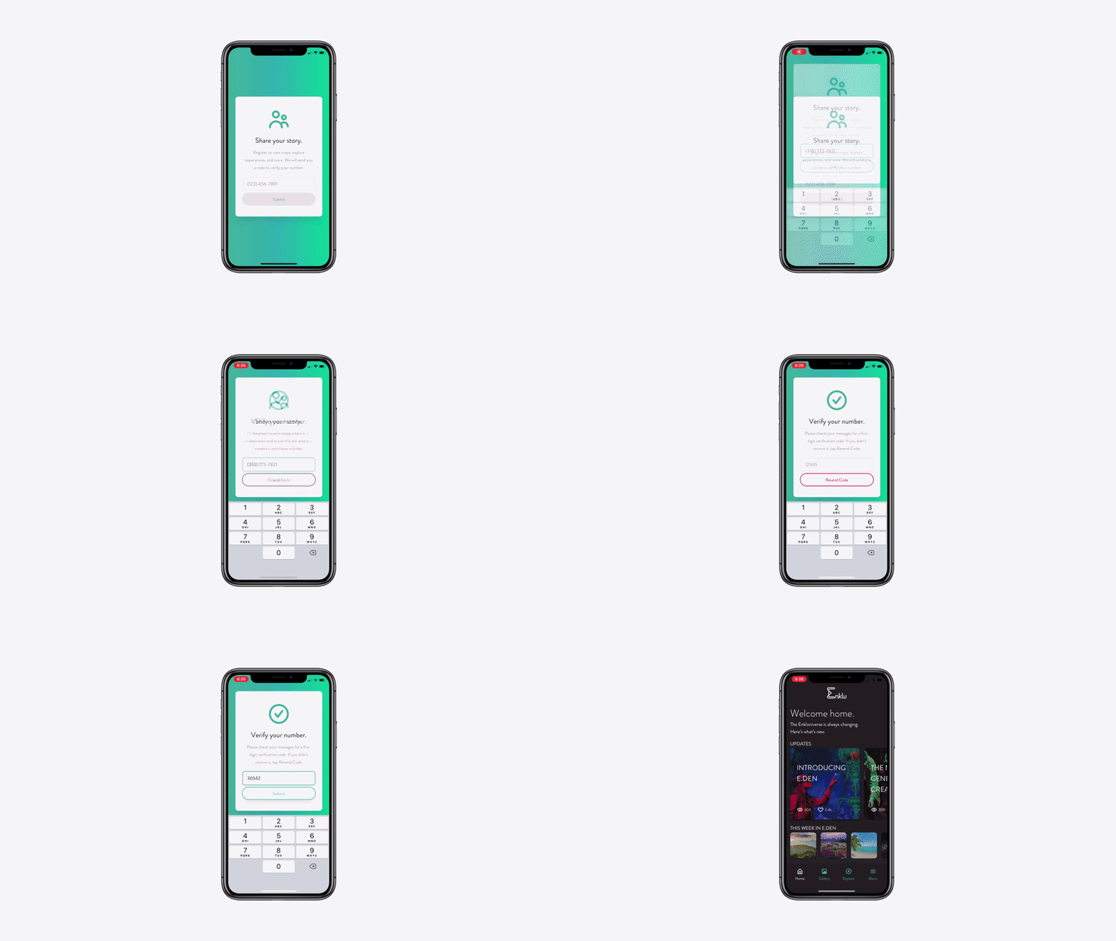
New user signs-up via their phone number.
In my opinion, registering with a mobile number provides the lowest barrier of entry.
You don’t have to remember a username or password (à la Postmates and Uber). Aside from that, I focused on using color and shadows to indicate system status. For example, the Submit button is greyed out and flat until the user enters a valid phone number. Green is good; red means something is wrong or needs to be repeated.
Engaging with the home feed.
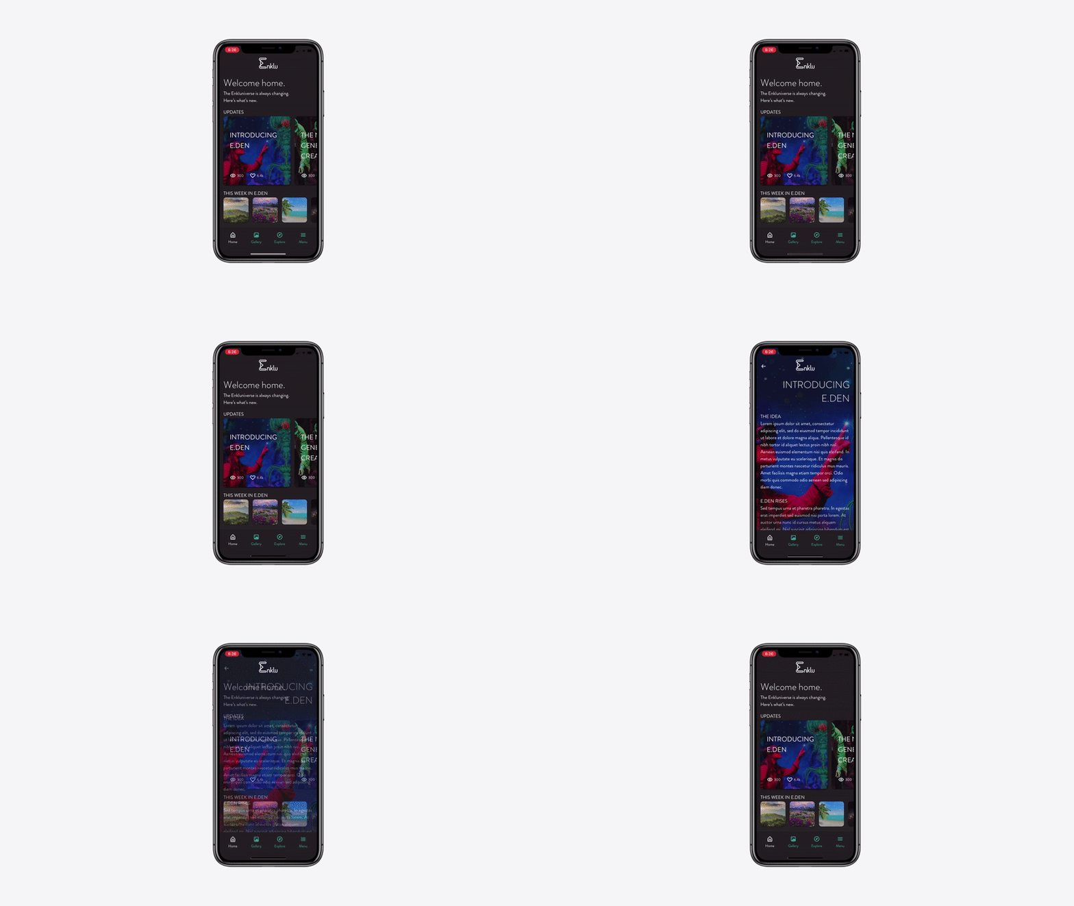
Infinite scrolling is fine, but it depends on all of the content within the feed being of the same type (e.g. Instagram’s feed is posts from users you follow). In this case, we had stories, photos, and more.
Therefore, I allowed the user to scroll both horizontally and vertically. Horizontal scrolling implies moving between content of the same subject matter, while vertical scrolling introduces new types of content. Tapping on a piece of content sends the user into an immersive experience where they are not distracted by anything else. Swipe right or tap on the arrow in the top-left corner to go back.
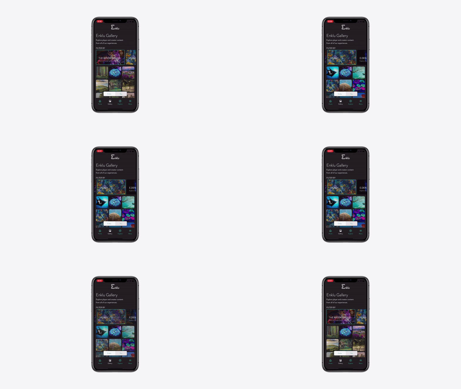
Filtering the global gallery by experience.
Enklu had created several beautiful experiences for their users to engage with. Each experience offered a unique world for the user to explore and capture.
In a way, each experience told its own story, so I felt that the photos captured within them should be housed in their own containers as well. Similar to the pattern established on the home screen, horizontal scrolling implied a difference in subject matter, while vertical scrolling implied depth.
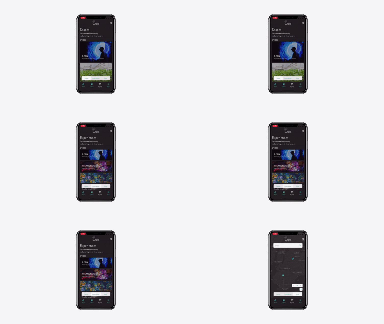
Exploring the Explore tab.
Experiences came alive within spaces (i.e. venues Enklu was associated with that had available Microsoft HoloLenses), but they also needed to stand alone.
In theory, you could engage with an Enklu experience anywhere there was a HoloLens. Therefore, I felt it was important to communicate that to the user. As a user, you can make reservations at venues, but there’s a chance an experience may be available at a pop-up event nearby.
Making a reservation at E.den.
I love good form design. It’s imperative to only ask the user for the necessary information and not all at once.
In this case, their mobile number is already associated with their account (they couldn’t have logged in otherwise). So, to checkout, all I asked for was the date they wanted to attend, their card number, security code, and billing zip code. Similar to the sign-up flow, system status was designated by color. Additionally, I have found that users are incredibly frustrated when they get locked into a form. I get the business rationale behind such a design, but providing the user with a way to close out leads to less frustration, more agency, and a nicer experience.
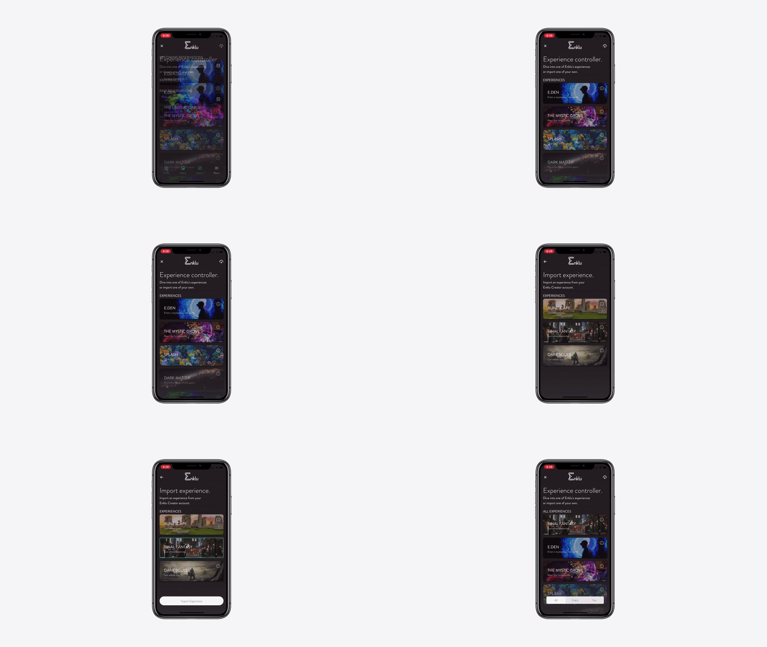
Importing an experience within the controller.
In this scenario, a user paired the experience controller with a HoloLens via a QR code presented to them within the app.
The user is also a creator that has created their own experience dubbed Final Fantasy via Enklu’s web editor. They tap on the import icon in the top-right corner to pull their experience from the cloud.
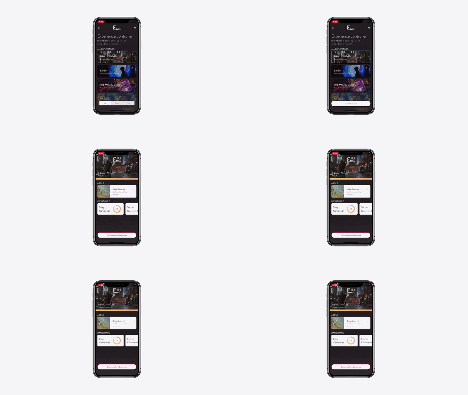
Launching an experience.
Jumping right in with a few taps.
Experiences have information, story completion rates, and discoverable secrets.
If you’d like to see all the screens I created, launch the prototype in InVision by clicking below.
A mini retrospective
Bringing it all together
Before this, I had never taken on a project that involved so many flows or work without the support of a team.
It was exciting moving between a bird’s-eye and a bug’s-eye view to understand how everything would connect. Moreover, embracing a lean UX workflow really sharpened my ability to manage multiple design processes at once. Designing one portion of the app while testing another informed my process in a way that I hadn’t been exposed to before. I’m proud of what I got done and created an entire design system for Enklu along the way in Sketch.
Did I solve the problem at hand?
The primary ask for this project was to create a mobile app that could serve as an event manager, experience controller, and pseudo-social-network. I believe I accomplished that and even took it a step further by creating an experience that was intuitive, cohesive, and enjoyable.

A bit about me
I’ve been to Muir Woods more times than I care to admit. It’s got some of my favorite trails and just makes you feel like you’re away from everything else.


