eCommerce Optimization at Trade Show Internet
Project summary
Moving past Google Analytics
How do you iterate on an existing experience without hurting what works?
A three-week sprint completed with Roberta Martins.
I worked as a user experience designer primarily responsible for planning and conducting research, synthesizing the data, and redesigning one component of our solution — the marketing email. Ultimately, it was a highly-collaborative effort with both of us being involved with every step.
What was the problem?
Google Analytics can tell you about a page’s bounce rate, but it won’t tell you why people are leaving. How do you unclog the sales funnel?
Trade Show Internet approached us with a problem they could not solve. Despite dominating SEO and providing a quality service, one of the branches of their business was struggling.
Their line of WiFi hotspot kits was experiencing bounce rates of up to 60%. Their pricing was competitive, and they had excellent feedback, so why was this happening?
Addressing the limitations.
How do you work around having limited access to your users? How do you improve upon an existing web experience without negatively impacting SEO?
Trade Show Internet’s sales funnel was clogged. With great SEO, awareness was strong. With positive reviews and client relations, the interest was there. However, with cluttered content, potential clients were leaving before they could even consider making a purchase.
Here’s what we came up with.
Leverage the reliability and trust of past clients and partners. Generate conversions through clear content hierarchy, an improved color system, and more.
From extensive research, we determined that Trade Show Internet was suffering from cluttered content management and messaging. We concluded that we needed to show users what they need to know in a way that is: consistent, comprehensive, straightforward, and discoverable.
We decided to focus on a three-pronged solution that involved redesigning three existing pages: the landing page, product page, and marketing email. By improving the information architecture, color system, content hierarchy, and by leveraging the trust and reliability of past partners, we got the job done.
Research and discovery
Clearing the air
Was WiFi performance and availability just not an issue anymore?
Before doing anything, we needed to start with the obvious. Were event planners just not concerned with WiFi availability anymore?
According to Event MB, 79% of event managers still believed that WiFi availability and performance was still a big issue for the events industry. Why were people bouncing from our product page?
Was cost the issue? Follow the money to find out.
Was the issue cost? Were these kinds of kits just not a priority for this market anymore?
Based on a separate survey by Event MB, that didn’t appear to be the case either. 52.6% of event professionals invested more in event tech in 2019 than in 2018.
Client interviews and usability testing
Getting the whole picture
Straight to the source.
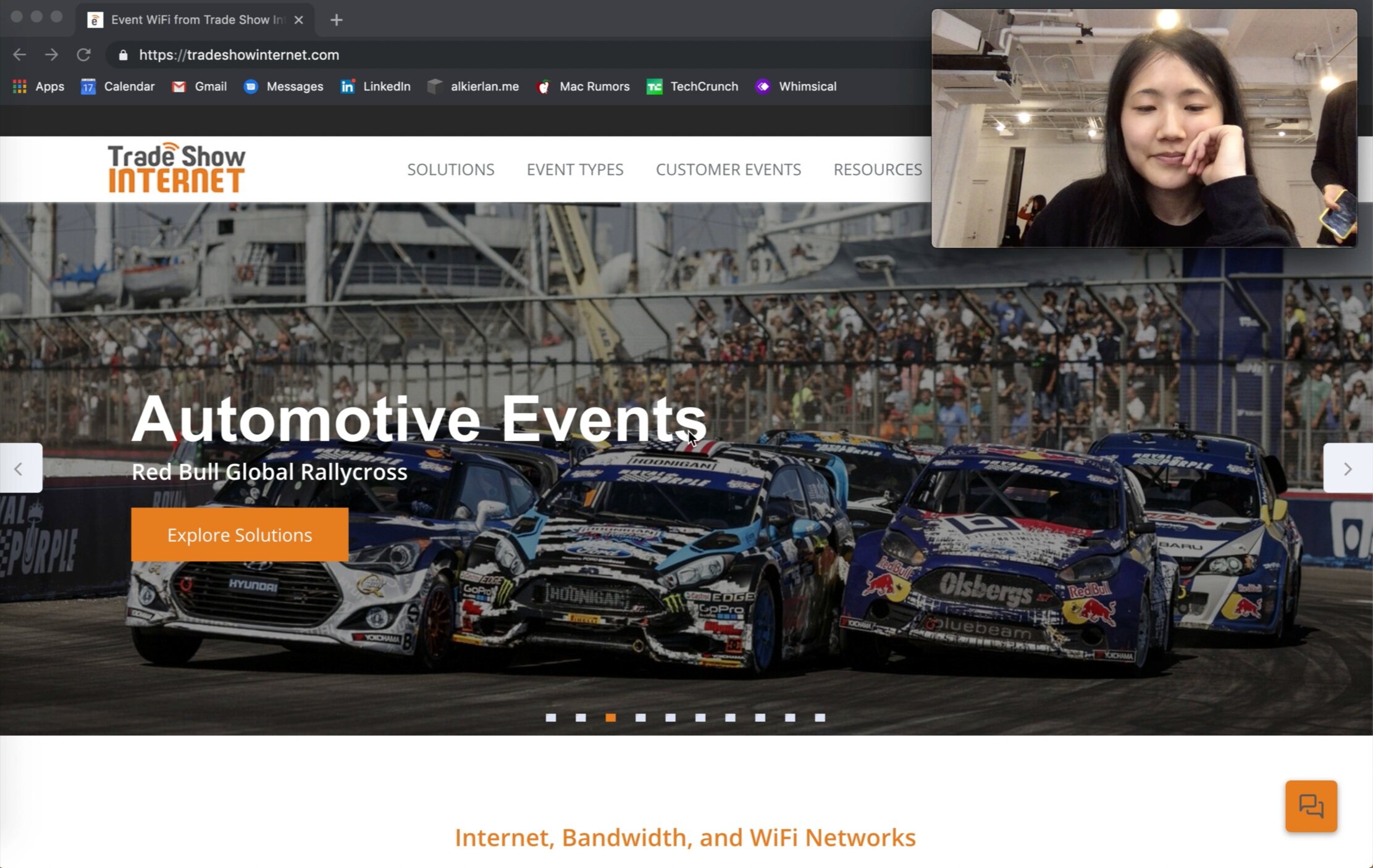
By speaking with current and past clients, we were able to gather opinions about Trade Show Internet’s website experience and more. We wanted to get a sense of how people felt about ordering the hotspot kits online and where there were hiccups.
We then went out into the field and conducted usability testing with event planners as well as individuals outside of the industry to deepen our understanding.
To account for all the different ways Trader Show Internet users were landing on the WiFi hotspot kit’s product page, we needed to investigate every point of entry. Thanks to Google Analytics, we knew that this included the site’s landing page, the product page itself, and their marketing email.
What did we learn about the landing page?
“I’m not sure what they do.”
“Woah, they’ve worked with Twitch?”
Almost all our participants felt overwhelmed and confused by the content and copy of the landing page
Once our participants saw the clients Trade Show Internet had worked with, they were very impressed
What did we learn about the product page?
“What am I getting? How does it work?”
We had participants navigate to the kit-rental product page and assigned them with the task of attempting to rent a kit.
Participants were confused about the scaling of the price
Participants were not sure where to look for important information
Not sure what they are getting or how it works
What did we learn about the marketing email?
“There’s too much text.”
We had the participants explore every component of the marketing email, from subject line to text.
80% of participants expressed that the email reminded them of spam
Not a single participant expressed interest in reading the text
Not a single participant clicked on the primary CTA
Field research
Filling in the gaps
Learning from vendors at the Bay Area Book Festival.
Limited to only three weeks, we did our best to attend an actual trade show. Sadly, the ones around us were hidden behind massive ticket costs. Luckily, The Bay Area Book Festival was taking place, hosting many vendors and organizations, each with their own booth.
As a disclaimer, it is important to note that this festival took place outside. Due to this, power was in limited supply. Some booths had generators to run screens or other equipment, but most did not.
Gotta work with what you got.
From talking to a couple of booths, one theme became abundantly clear. Many exhibitors simply did not have a need for a larger networking solution.
For payments, many booths were using Square and if they needed further connectivity, they either used one of their phones as a hotspot or took advantage of the city’s WiFI.
One booth (a publisher), was using a small, portable modem that can be rented or purchased, but that was an exception.
Informing our design process.
From further conversation, a larger networking solution would have been more welcome if its value was apparent.
Many booths just did not see the need to rent a larger kit or get a better solution, because what they had “would do” for less.
How can we amp up the perceived value to replace the mindset of “making do” with a need and known benefit?
Learning from our competitors
Trust, hierarchy, and succinctness.
We chose to focus on competitors that truly mirrored Trade Show Internet’s offerings. Ones that offered both full-scale networking solutions and rental WiFi kits.
Castle Point, Case of WiFi, and FestFi did not appear to match the level of service of Trade Show Internet, but outperformed in content management.
Clear call to actions, straightforward product descriptions, highlighting differentiating features, and leveraging the reliability and trust of past partners. These were the things we needed to adopt.
Synthesizing the research
Making sense of a mess
When it doubt, bring out the Post-its.
From our research and testing, we compiled our insights and categorized them first based on what the insight was referring to and then the underlying why or pain point behind the insight.
We developed these user-opinions as design-anchors based on the final groupings:
I’m overwhelmed by the amount of text
I can’t scan for the information I’m looking for quickly
It would be nice to talk to someone and get an answer right away
I want to give you my money. Why aren't you helping me do that?
I'm annoyed that text in UI is misleading (e.g. calculator)
Where am I going and where will this take me (i.e. information architecture and site organization)?
Organic and non-GMO.
We wanted to understand where we could have the most impact in the least amount of time. From our research, we put together two journey maps to illustrate the problem areas to the client.
For those that found TSI via organic search, they experienced a lot of confusion around the landing page. If they were motivated enough to stay around, the sentiment improved, but quickly dropped when landing on the product page.
Spam, spam, spam.
For users that reached TSI via marketing email, it was slightly worse.
Initially, there was positive momentum from a great subject line that was both positive and encouraged action.
The second the email was opened, however, users were turned off. There was a massive amount of copy, low-resolution images, and the primary CTA did not work.
From extensive research, we concluded that we needed to deliver information in a way that:
Leveraged and amplified a sense of trust and reputability
Communicated value quickly and effectively
Allowed the user to make an informed purchase decision without feeling overloaded
We decided to focus on a three-pronged solution that involved redesigning these existing pages:
Landing page
Product page
Marketing email
Here’s the insight
Who did we design for?
Meet the middle-tech planner.
We needed a way to hone our insights by focusing on Trade Show Internet’s primary user.
Based on our research and conversations with the Trade Show Internet team, we formulated the middle-tech planner archetype.
They are deliberate, confident, and tend to plan in advance
They are comfortable with technology, but don’t care about knowing the inner-workings
They just want to get the relevant information quickly
They want to know when they’re saving money
They need to feel confident and trusting toward the company they’re working with
Leveraging color, content, and hierarchy
Let’s help the middle-tech planner by improving the layout, signals from color, and content hierarchy. Let’s make it easy for them to get things done with clear call to actions.
Putting pen to paper
From research to marketing.
I focused on redesigning the marketing email and creating wireframes for the landing page.
Show me the before pics
Pre-redesign
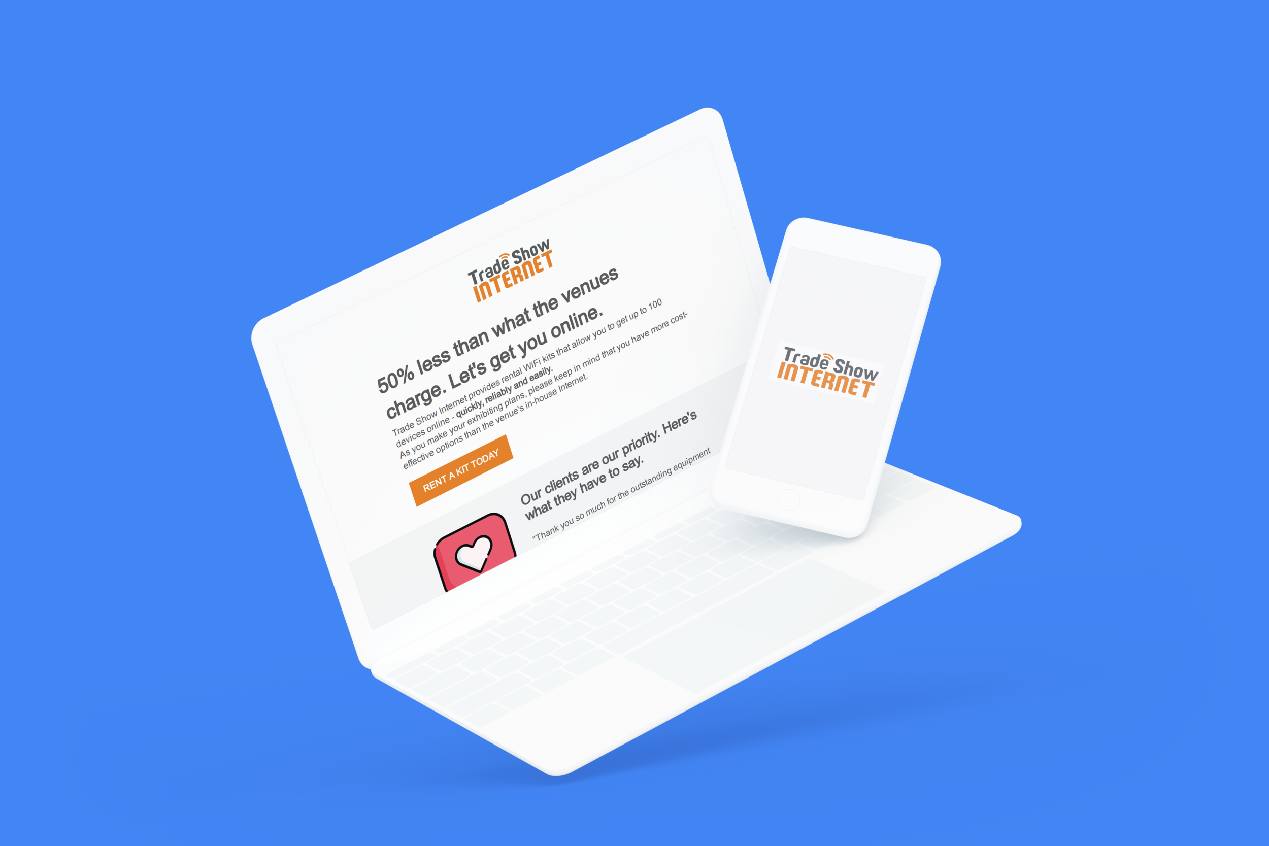
The original marketing email.
Remember the usability tests from earlier?
One of the most common pieces of feedback we got was that the marketing email looked like spam.
Most users we tested with told us that they would probably open the email, see the overwhelming amount of copy, and then delete it assuming that it was spam.
If we were going to generate conversions, I needed to change that perception. Why? The marketing email served as one of the first points of entry for many potential customers that were bouncing. See how I improved it below.
What about the landing page?
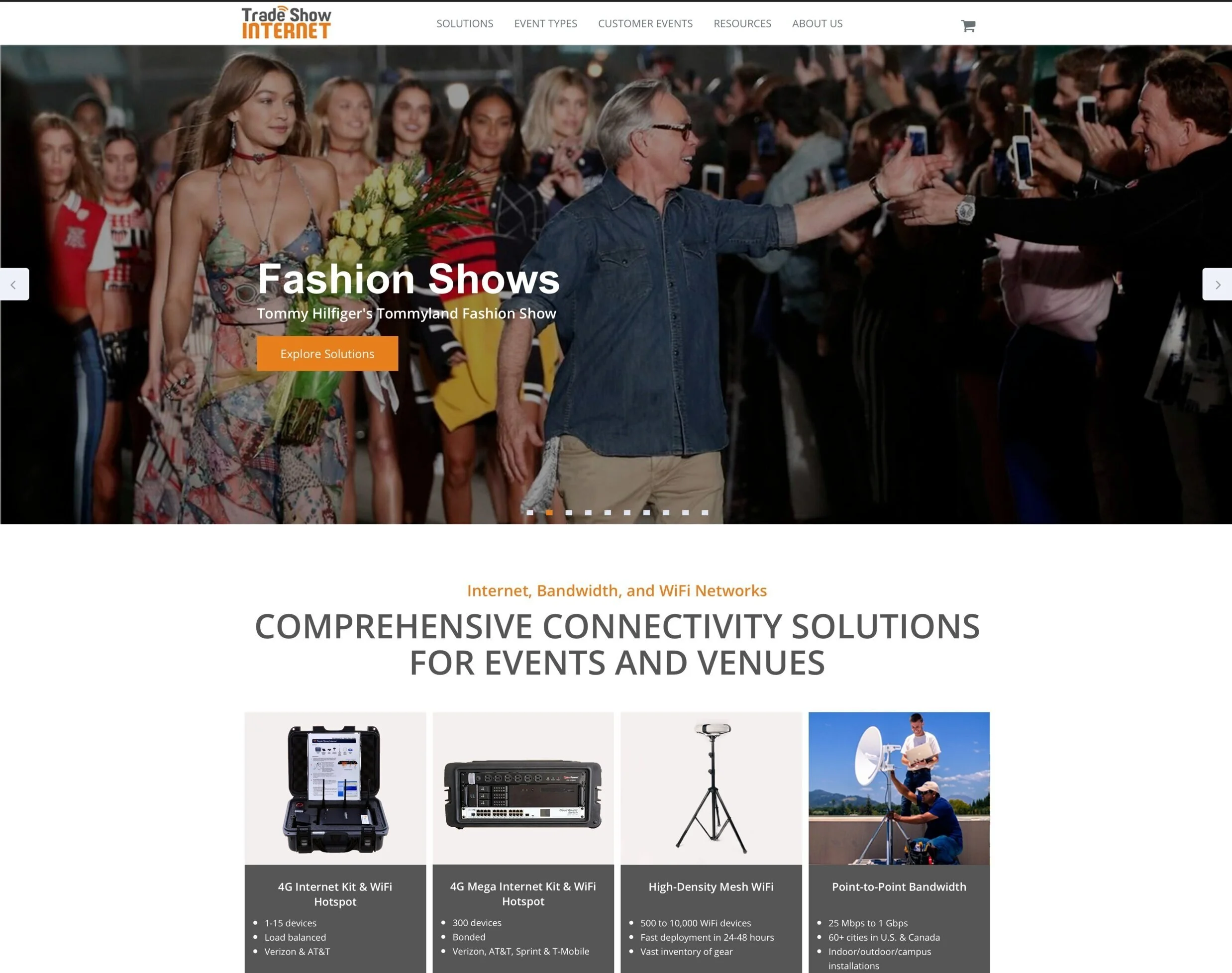
Based off the landing page alone, most participants had no idea where they were.
A majority of participants were confused about what the site was about. Once they navigated below the fold, it was clearer, but still not enough.
All participants were impressed by the previous brands and companies TSI had worked with.

Transforming spam into wham
Straight to the point.
Versus trying to communicate value through a copious about of text, I thought it was vital to do so via color, testimonials, and strong, active language.
Focusing on the essentials.
I cleaned up the copy to focus on essential information that would empower the middle-tech planner to make an informed purchase.
This was more than just a mockup, it was a full HTML/CSS template for the client. By center-aligning content, it allowed the email to be easily scalable, no matter what size the screen was. Moreover, I added graphics, demonstrated value, and added client testimonials, all while reducing file size.
A win for the middle-tech planner.
How did this design benefit our archetype?
It creates a sense of trustworthiness via client testimonials and past partners
It gives them clear direction through an obvious CTA
It demonstrates value via a clear content hierarchy and only providing the relevant, vetted information
Leveraging the trust and reputability of past clients and customers
From wires to low-fi
Design studio and ideation for the landing page.
We started with a design studio session between the two of us and then with the client.
Involving them in the process was incredibly helpful as they took partial ownership of the redesign, understood why we were proposing the solutions that we were, and how we were thinking about the project.
In my experience, it is much easier to convince a stakeholder of a certain direction when they dip their toes in the waters of design and engineering.
Refining on paper.
Three questions that we needed to answer for the user right away were:
What is Trade Show Internet?
What services and products do they offer?
Why should I trust them?
So, we immediately emphasized call to actions, TSI’s identity, and establishing trust via past brand partners.
We went through several iterations on paper.
Preparing for the hand-off.
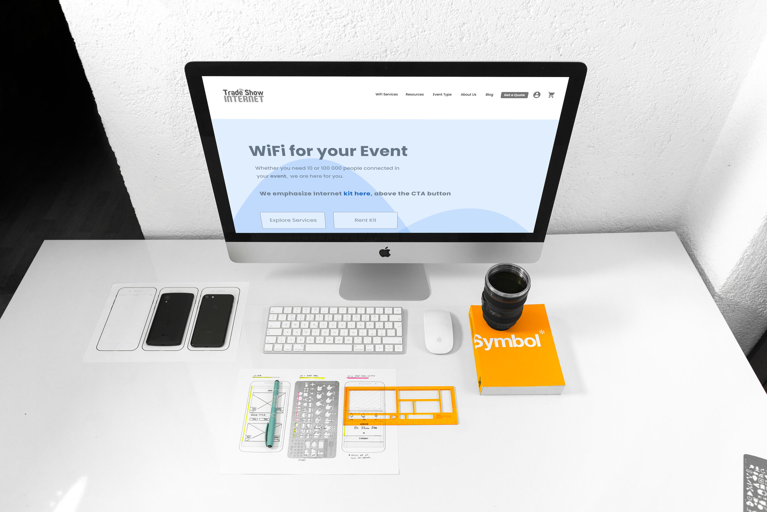
I incorporated our insight into a low-fidelity wireframe using Figma. My goal was to make Roberta’s life as easy as possible while she perfected the color, typography, and more.
A mini retrospective
Bringing it all together
Here’s what the client had to say.
The client was incredibly enthusiastic about our work. We handed off a full, annotated appendix, complete with our research, methodology, and rationale behind individual decisions.
Did we solve the the problem at hand?
Yes. Based on the feedback from the client and past TSI customers, I am confident that our solution will not only reduce the 4G WiFi hotspot kit’s bounce rate, but improve Trade Show Internet’s reputability and trustworthiness across the board. Once the changes are implemented, I’ll be sure to update the relevant information here.

A bit about me
One of my favorite movies is My Neighbor Totoro. Have you seen it?


